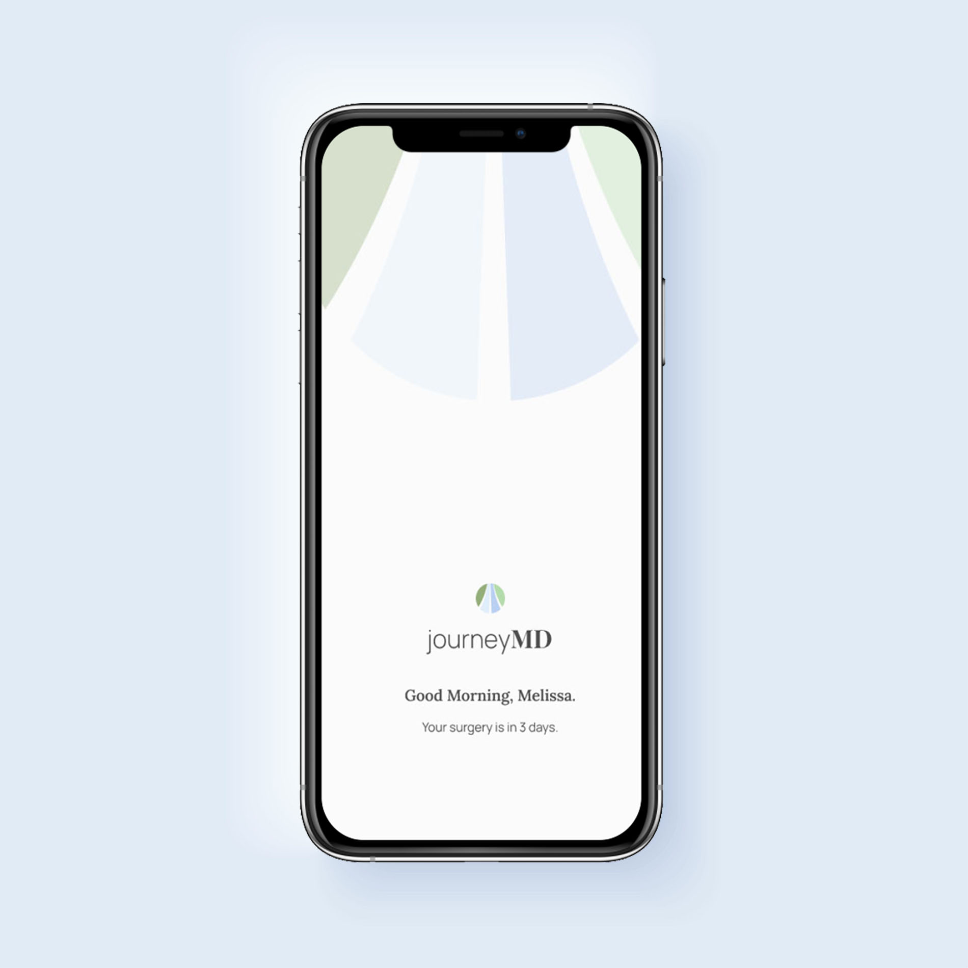
JourneyMD
Surgery is a journey. Let's walk it together.

CONCEPT PROBLEM
PROJECT TYPE:
Niche, short-term Surgery companion app
MY ROLE:
Research, Product, and UX/UI Design
INDUSTRY:
Hospital networks and medical offices
Surgery is Complicated
Everyone deserves an easy, safe, and successful surgery. But, the journey from diagnosis to full recovery can be lengthy with unexpected twists and turns.

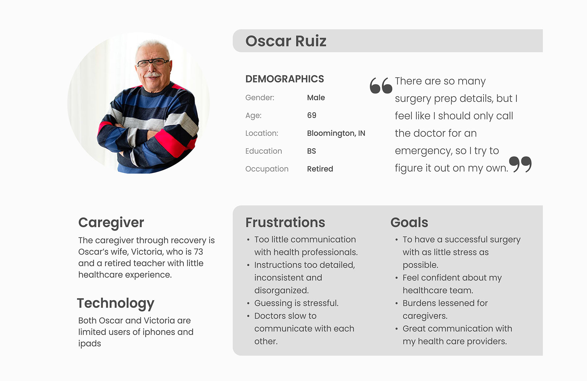
The Patient Side:
Pre-surgery, improper preparation results in delays and significant stress. Post-surgery, problems not addressed during the home recovery phase lead to extended pain and re-admission.


The Provider Side:
Meanwhile, doctors are often forced to reschedule procedures risking timely, life-saving treatment, as well as, fiscal opportunities.
The Cause:
Most hospitals and medical offices still rely on a folder filled with papers or a brochure. While this method fails both sides throughout the journey, it is still overwhelmingly used.
RESEARCH INTERVIEWS

8 participants interviewed 2 colon surgery recipients (within 1 year) 5 direct caregivers 1 endoscopy professional
Patients and families interviewed for this project reported feeling confused and stressed at every point in the process when reviewing these surgery materials at home. Instructions steps were frequently, incomplete, or worse, contradictory.
Interviewee feedback also demonstrated patients and families are reluctant for a variety of reasons to call health providers when questions arise. Those that do, often do not receive a timely response.

We had a question about the prep drink for my husband's surgery who is diabetic. No one got back to us at the doctor's office. The pharmacist wasn't sure. We took a risk and hoped he would be eligible for surgery the next day.
It was stressful.
PERSONA
COMPETITIVE ANALYSIS
Pros:
step-by-step approach, friendlier language approach
Cons:
poor information architecture, illogical progression, too many options, confusing
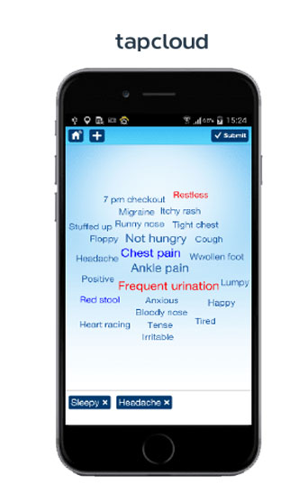
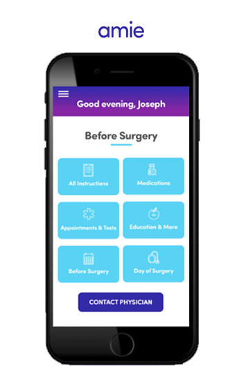
Pros:
reminders, email messaging between patient and provider
Cons:
centered around a word cloud diagnosis feature, small text, difficult to use, poor Apple Store reviews, gimmicky
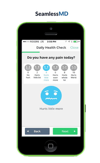
Pros:
step-by-step approach, checklists, reminders
Cons:
too much extraneous info for easy use, heavy text, small type, outdated style, compatibility complaints, lacks warmth
What works and what doesn't.
Ultimately, competitor apps miss the mark. But, a few core ideas can be a starting point for great things.

step-by-step process
A clear, logical, and concise flow of information is critical

Information overload
Too much information and poor-performing gimmicks are to be avoided

not user-centered
Small type, heavy text, and illogical information architecture will not work for unwell and older users
A NEW APP
This demographic needs a surgery companion app providing critical health care expertise, in real-time. One allowing users and healthcare providers to openly communicate for the success of the journey.

Tailored for the Users
Most patients preparing for surgery are not feeling their best regardless of age. Additionally, the average age of surgery recipients is 58 years old as of 2020. Knowing these patients are particularly vulnerable to physical and cognitive fatigue, a communication system providing highly detailed and often contradictory information with no direct follow-up is counter-intuitive.
Research shows seniors will adopt technology, enthusiastically even, as long as it is logical and easy to use.

Four participants (two research participants and two new to the process)
Two separate sessions
Five tasks given and participants asked to think aloud
Clickable prototype provided

CORE FINDINGS
During the first two iterations of user testing, three goals became evident. A user-centered app must have clarity, friendliness, and style.
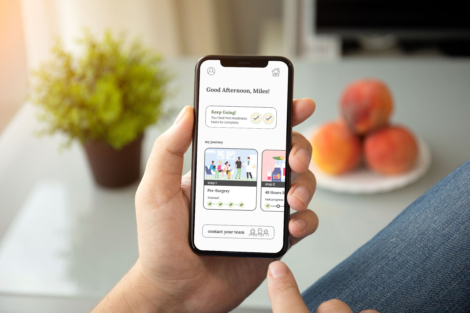
Guaranteeing essentials are on the home screen:
User profile, each step of the journey, and the "contact your team" option all need to reside on the home screen without overloading the user.
A manageable number of tasks per step:
The step system only works if the tasks are not overwhelming. It was determined no more than three tasks would be asked to complete the step.
Modern style with increased sizes across the board:
In contrast to competitor designs, text was minimized, font size was boosted, buttons became larger elements, and the style reflected positivity.
Navigation that stays close to home:
JourneyMD keeps navigation shallow to minimize confusion. The user will never go more than three screens away from home.
UX REQUIREMENTS
Rapid one-touch access to healthcare providers
Abundantly clear step-by-step progression
Manageable tasks (checklists, reminders)
All relevant healthcare providers included in contact list
Only essential information provided
Continued support through home recovery
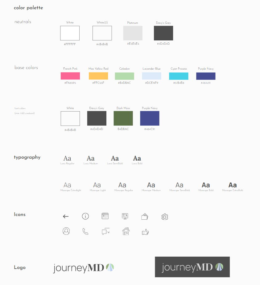
UI REQUIREMENTS
- minimum font size 14pt
- highly readable fonts
- oversized buttons
- text contrast minimum 7.60
- positive colors and language
- shallow navigation
- relevant illustrations
- critical buttons prominently placed
- all information can be re-accessed
- no more than 3 tasks per step
DESIGNING FOR ACCESSIBILITY, WARMTH, AND OPTIMISM
JourneyMD users are facing a challenging moment in their lives, both physically and emotionally. The branding choices must reflect the feeling of positivity and support.
NOTEWORTHY SCREENS AND FEATURES
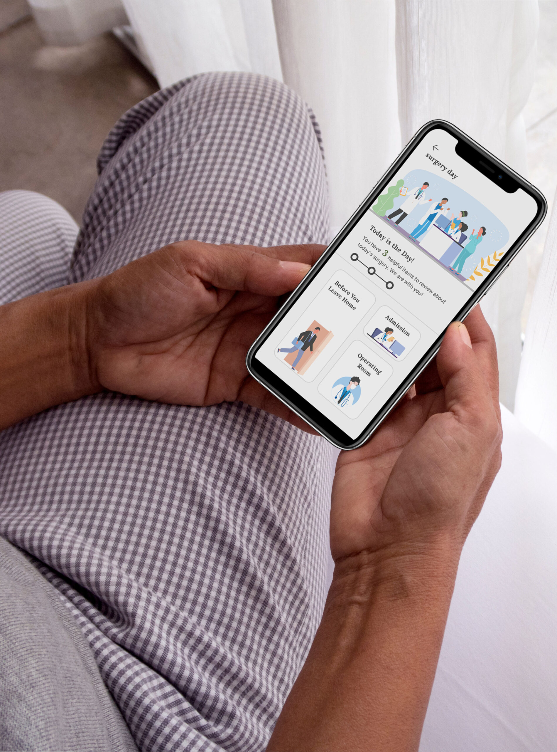
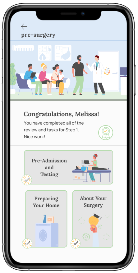
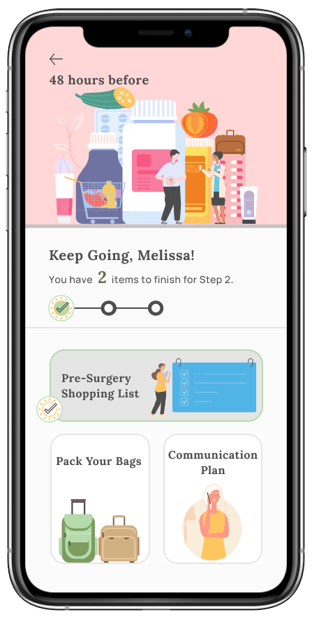
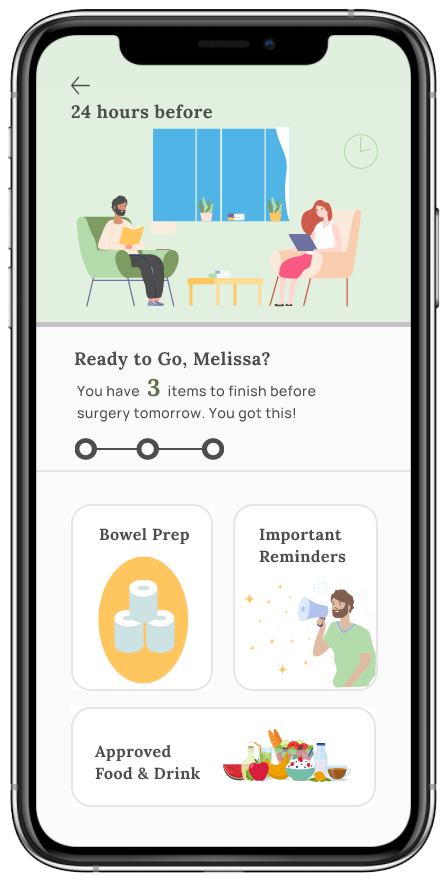
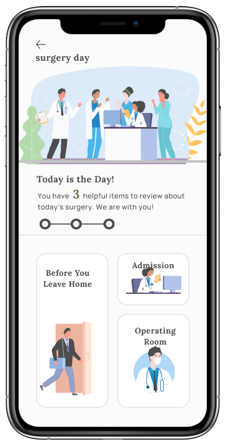
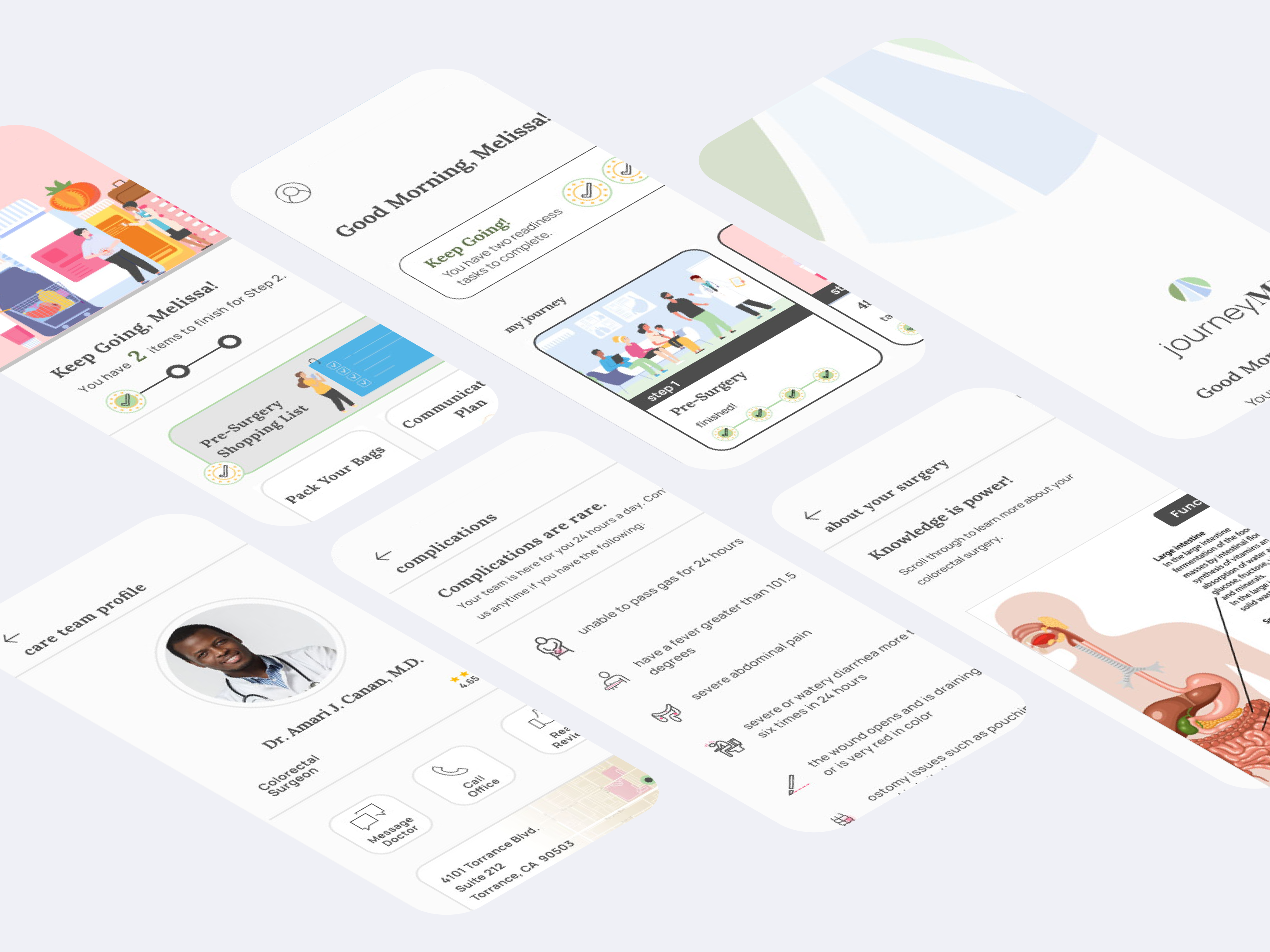
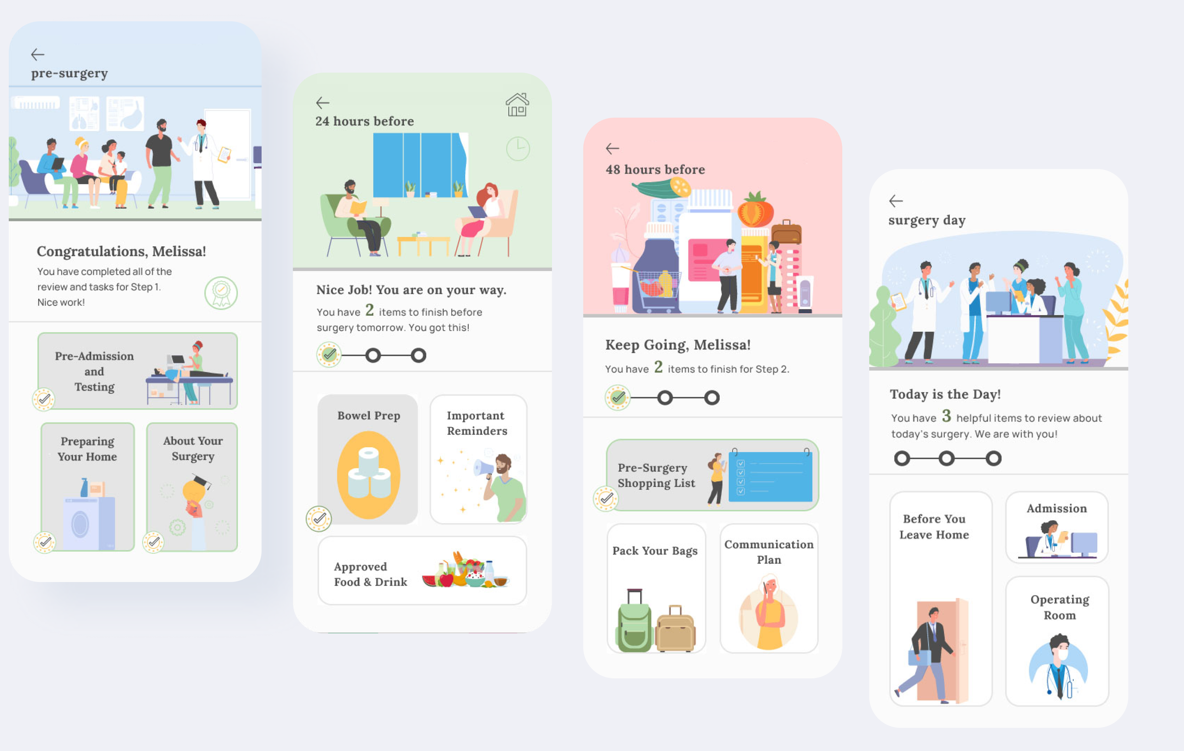
TRULY EASY STEP-BY-STEP
A step-by-step process sounds self-explanatory, but it is all in the details, particularly with unwell users. Using the paper instruction method, preparing for surgery was unclear and problematic. Competitor apps struggled greatly with clarity as well.
With JourneyMD, the home screen immediately informs the user where they are in the journey and what is needed next. Each step requires only three low-stress readiness tasks to assure the patient is not overwhelmed. Once tasks are finished, the user is congratulated and given confirmation the step is complete.
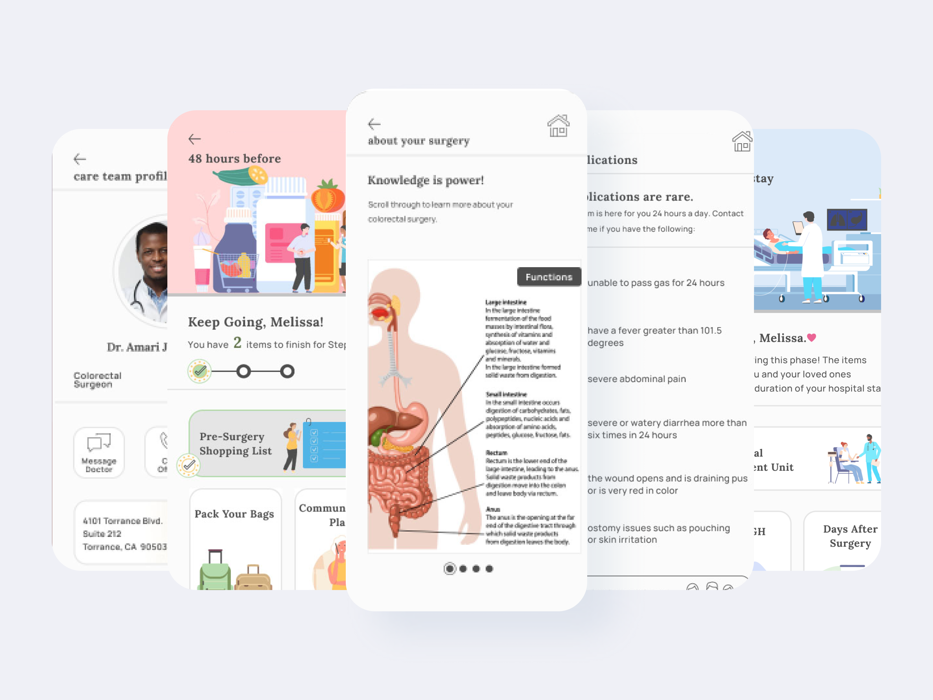
REASSURANCE FOR EVERYONE
A critical task from the surgeon’s perspective is the “Confirm Your Surgery” task. It resolves the surgeon’s most critical pain point by assuring the patient is ready for surgery as scheduled. This drastically reduces lost time in the provider's tight schedule. It also confirms additional surgical team members are ready as well.
With one single task, all essential medical teams, the patient, and the patient’s family are reassured the process is going according to plan and on schedule. The emotional and practical benefits of this feature are impressive and unique to this app alone.
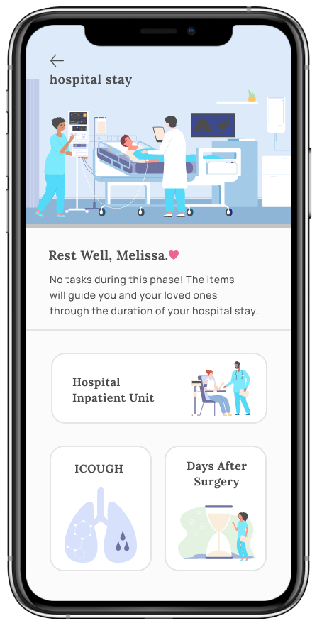
HOME RECOVERY IS HALF THE JOURNEY
The Home Recovery step is by far the longest phase of the journey. Research shows this is the point where patients feel most disconnected from their healthcare team. Face-to-face time with doctors is limited and questions often come to mind after release. The “Contact Your Team” section provides critical support for worry-free home recovery.
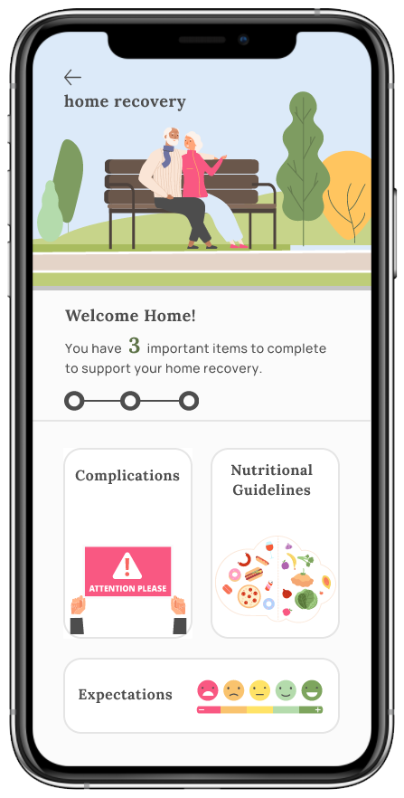
For example after colorectal surgery, the patient is required to be on a strict high-fiber diet. However, if he is diabetic, this instruction might be worrisome. By having an open line of communication with all of your doctors, patients feel supported and stress is reduced.
From the healthcare team’s point of view, additional avenues for questions avoid complications and readmissions. Another essential feature of the Home Recovery step is the “Complications” section. This simple breakdown of the most serious post-surgery issues offers a direct link to the “Contact Your Team” area of the app where the user can contact a physician immediately.
For user journeys, personas, prototypes, and more check out the full case study here: